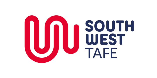
New logo reflects transformation of SWTAFE

From Monday November 13, a new South West TAFE logo will replace the outdated design created more than 20 years ago.
The new logo combines the inter-locking letters ‘S’ and ‘W’ into a dynamic line graphic representative of a fingerprint. “It symbolises an individual’s education pathway and how every journey is unique – just like a fingerprint,” South West TAFE CEO Mark Fidge said.
Mr Fidge said the new brand identity adopts a progressive and contemporary look that re-positions TAFE to better align with TAFE today.
“The logo presents TAFE as being energetic and progressive, innovative and inspiring,” he said. “We offer future-focused education and training and we now have a more confident logo to reflect that.”
The new logo will be rolled out across all South West TAFE campuses over the next two years, commencing with the 2018 enrolment campaign which starts on November 13, along with the new brand being applied initially to all brochures, social media, major signage, vehicles and a new website in December.
The innovative design was created by local graphic designer Jody Miller in partnership with South West TAFE’s own designer Josie Ellerton.
Mr Fidge said the benefits of a strong brand were tremendous and would help TAFE to secure a stronger profile. “The previous logo was created around 1997 and no longer reflects who we are today,” he said. “We wanted to re-position ourselves as a 21st century career maker that inspires the regional community to take advantage of what education provides.”
The new logo follows extensive customer research which highlighted a gap between people’s perceptions of TAFE and the reality of what the organisation offers today.
“We provide relevant skills; experience and practical training that are up-to-date with latest industry standards and lead to successful pathways to in-demand jobs,” Mr Fidge said. “We’re a progressive education provider and want to reflect that in our future branding.”